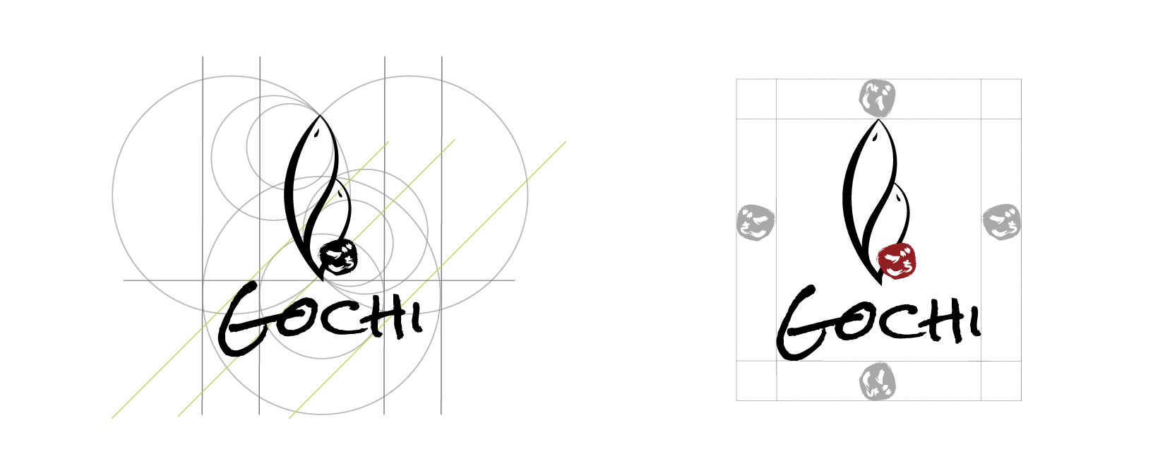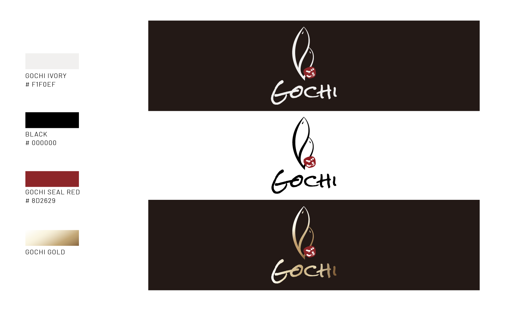
A redesign project for a local Japanese restaurant named Gochi.
Overview

Gochi is a Japanese fusion tapa restuarant provides authentic and unique dining experience. With our variety collections of tapa menu, you are going to begin a exotic gastronomic adventure. Here at Gochi, we nont only redefine the “Japanese Fusion”, but also reinvented what it mean.
Gochi, short for Gochisou - delicious hearty meal.
-
Role
UX Designer
-
Skills
Brand Identity
-
Team
Individual Project
-
Timeline
Sep 2017- Oct 2017
Design Process
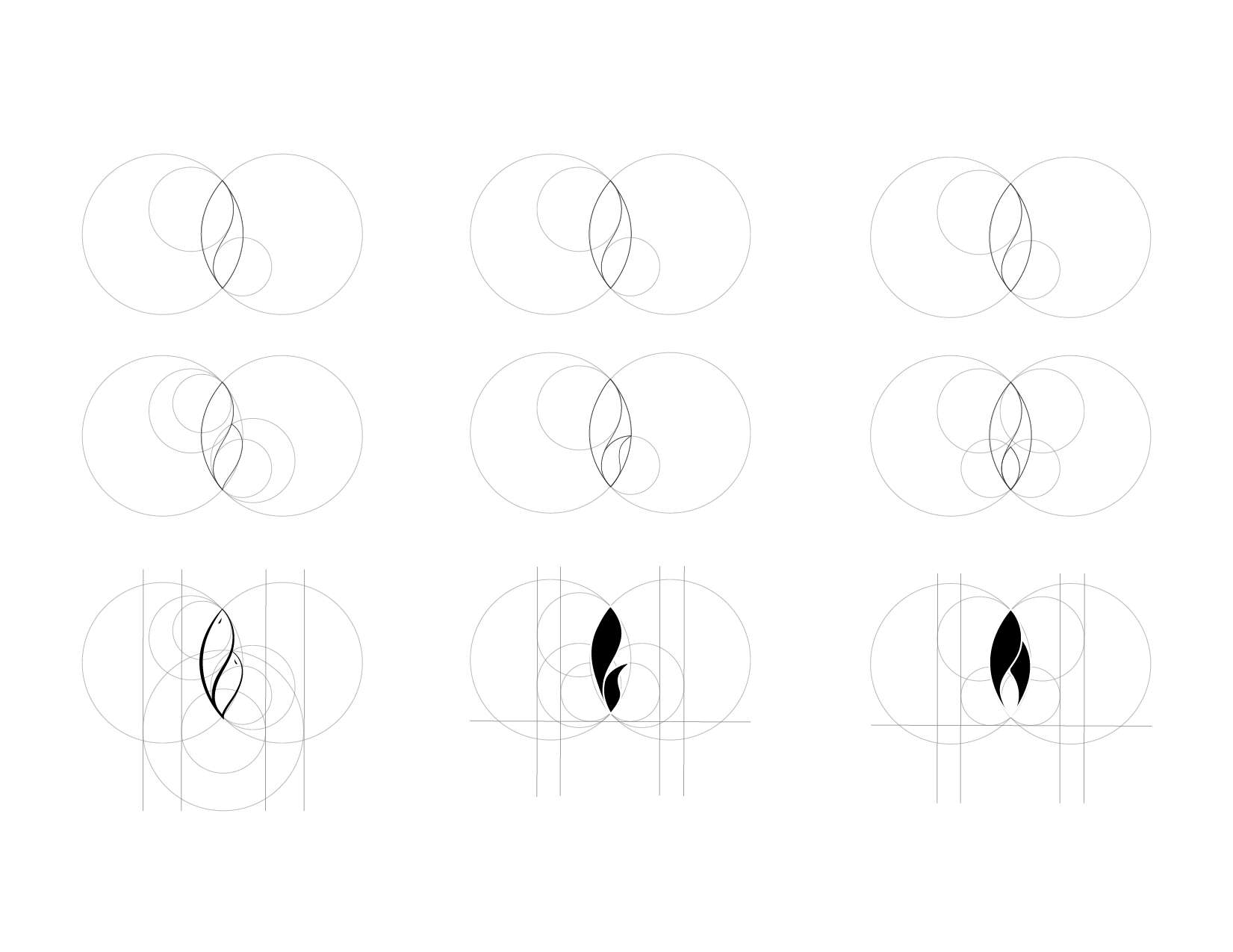
Concept
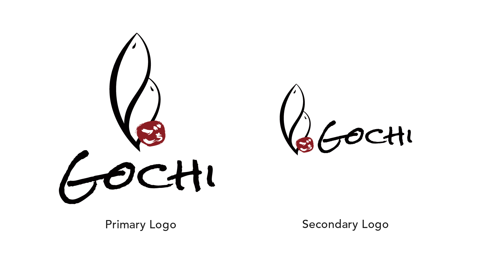
Gochi is a Japanese fusion tapa restaurant, I used circles to represent the varieties of tapas fuse together with the brand. Inside the intersection part of all the circles, I drew the fish figure to represent japanese food which contains a lot of seafood as one of its major ingredients.
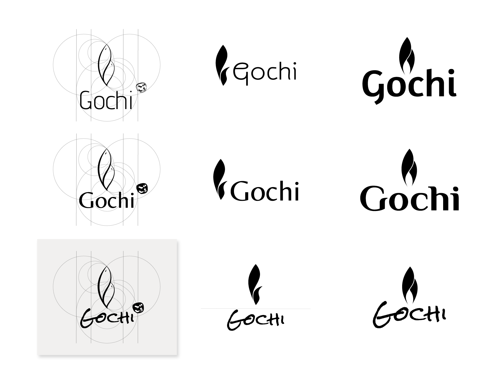
Variations
Match the logo with different typefaces to develop the brand identity that represent Gochi the brand most. I tried to avoid adding too many modern elements into the design since Gochi is a local Japanese restaurant opened in 2005.
The local customer have deeply emotional attachment with this brand, a traditional trend of design would help to retain these feelings.
Brand Guidelines
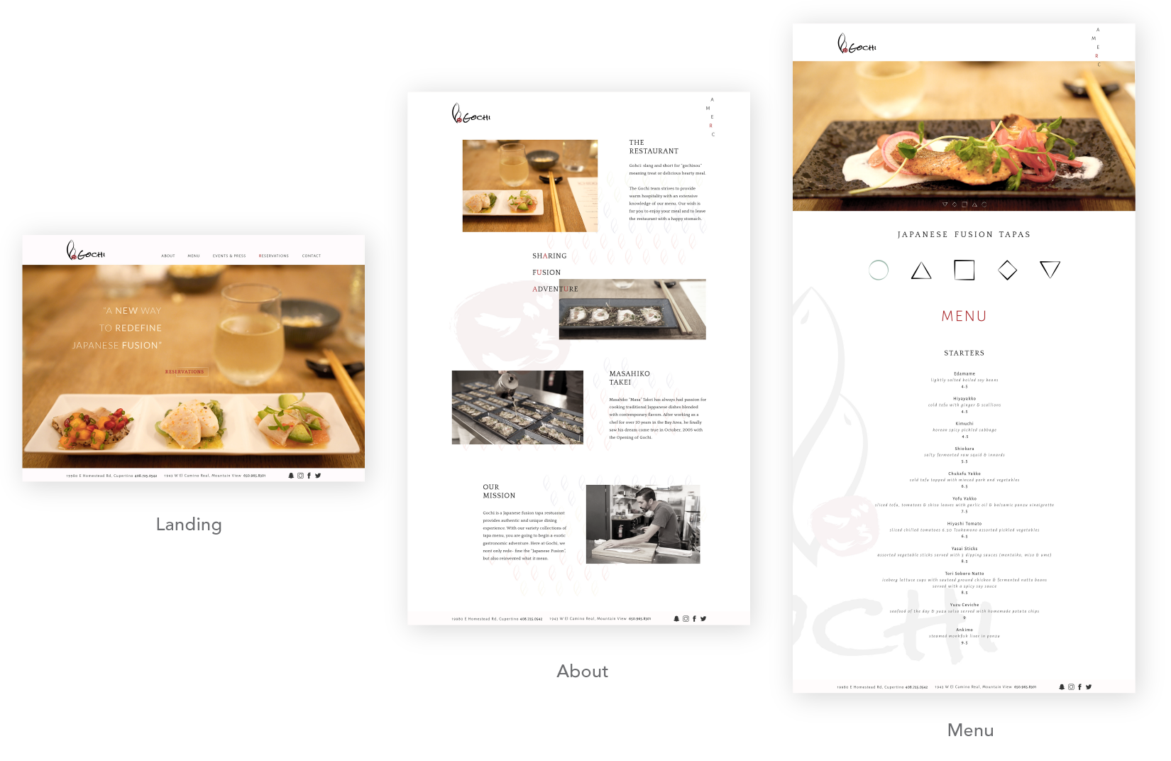
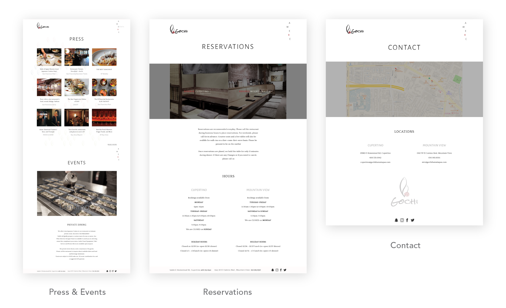
Website
Merchandising
